Security Detections Dashboard Layout
1. Header Controls:
At the top are search and filter options for refining the display of alerts based on specific criteria, such as time frames.
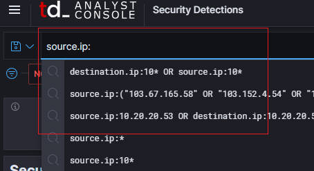
- Search Query for Lucene Language: Alerts can be filtered using Search language Queries.
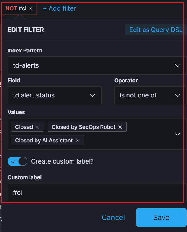
- Gui Filter: User can set the filter here to filter alerts.
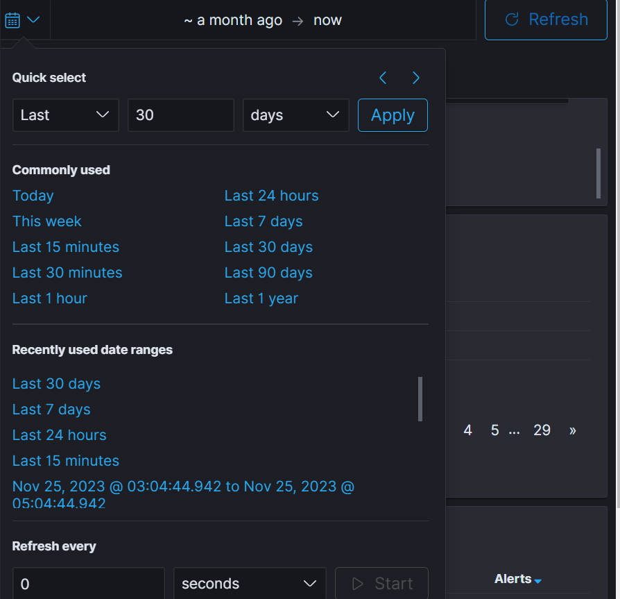
- Time Filter: Set the start and ending time to filter alerts.
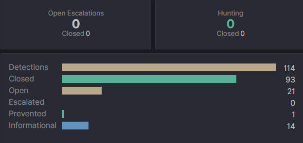
2. Security Detections by Severity:
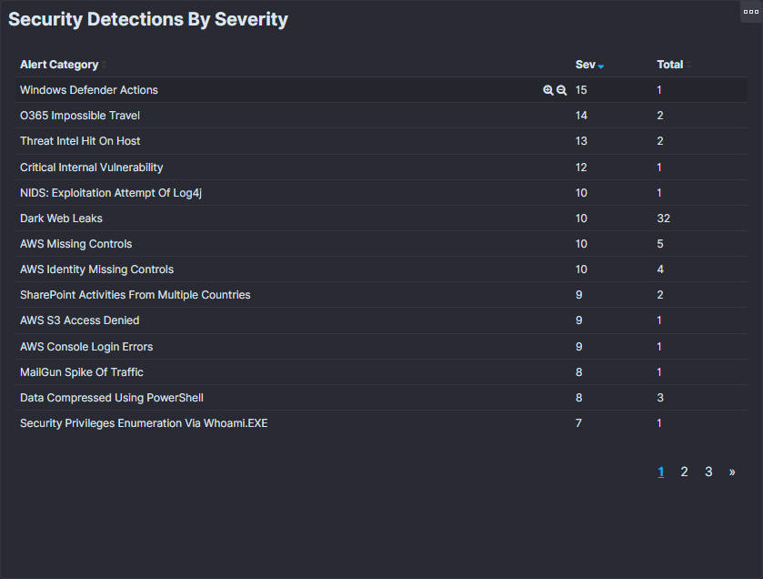
A table listing alert categories with corresponding severity scores and totals, allowing for prioritization of responses. This section categorizes various security alerts, arranges them by severity, and displays each category's total number of occurrences. The paging control at the bottom indicates that multiple data pages are available for viewing. This layout is designed to quickly identify and prioritize issues that need to be addressed in the context of network or system security.
3. Summary Metrics:
Displays total alerts, escalated cases, and alert status for quick reference.
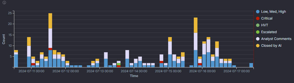
4. Security Detections Over Time:
This section depicts a bar chart titled Security Detections Over Time, which visually displays the frequency of security alerts over a given time period. The x-axis represents time, with labels indicating specific dates and times. The Y-axis measures the number of detections, quantifying the number of security alerts. Additionally, users can customize their visualizations by clicking on items on the right, a feature that may help analysts focus on specific types of alerts for detailed analysis or reporting.
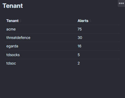
5. Impacted Tenant:
Lists tenants affected by the alerts, which helps manage client-specific security issues.
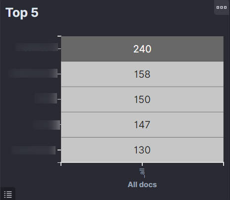
6. Top 5:
The "Top 5" section of the dashboard displays the sources of the alerts, which can be either IP addresses or names of the systems. Each row represents a distinct source, and the number next to it shows the total count of alerts generated from that source. This helps identify which entities generate the most alerts and may require further investigation or immediate action.
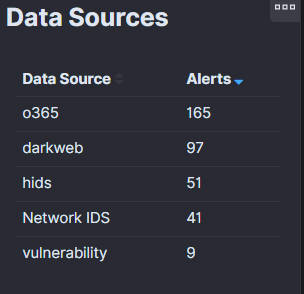
7. Data Sources:
The "Data Sources" section of the dashboard provides information on the origins of the alert data within the security system. It lists various monitored modules or systems, such as O365, hids, Network IDS. Each module is associated with a number indicating the total number of alerts generated. This information is crucial for identifying which modules are most frequently reporting security incidents and may help pinpoint where potential security vulnerabilities or breaches are occurring. The list also allows for the prioritization of resources and attention based on the frequency of the alerts.
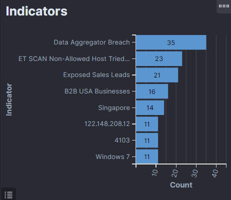
9. Indicators:
The "Indicators" section on the dashboard shows the most frequent indicators of compromise or suspicious activities detected by the security system. Each bar on the horizontal bar chart corresponds to a specific indicator, such as a type of network traffic, a pattern of behavior, a signature of a known exploit, or any other metric used to identify potential security threats. Such data helps security professionals identify the most common threats and spot emerging trends in real-time, enabling them to prioritize their response and focus their investigative efforts on the most pressing security concerns.
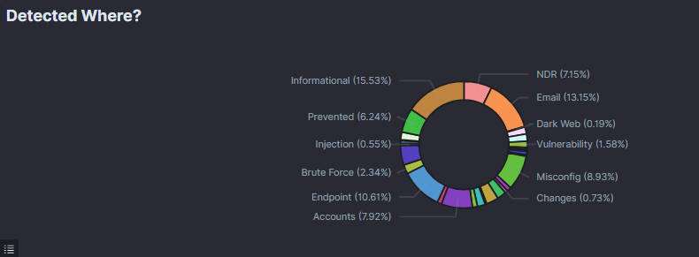
10. Detected Where?
The "Detected Where?" section on the dashboard shows where various indicators of compromise or suspicious activities are detected within the security system. The chart is a circular ring graph displaying different categories, each representing a specific detection location or event type. This visualization helps security professionals quickly understand the distribution of security events across different areas, enabling them to prioritize response efforts and address the most significant threats effectively.
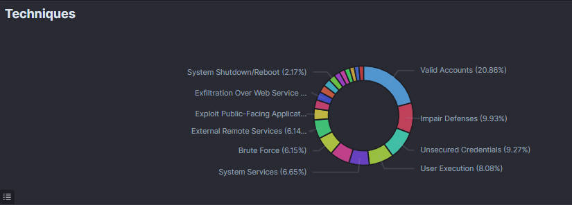
11. Techniques
The "Techniques" section on the dashboard illustrates the various techniques used by attackers to compromise systems or carry out malicious activities. This section is represented by a circular ring graph, which categorizes and color-codes the techniques to show their prevalence. Each segment represents a specific technique, such as System Shutdown/Reboot, Exfiltration Over Web Service, etc. The percentage next to each technique indicates its proportion among all detected events. This visualization assists security professionals in identifying the most frequently used attack methods, allowing them to fortify defenses and focus on mitigating the most common and dangerous techniques.
12. Detections Feed:
"Detections Feed" or log, which lists individual security alerts generated by the monitoring system. Each row provides critical details about a specific alert, including:
-
The time the alert was generated.
-
A name or title for the alert that indicates the alert's type or category.
-
A detailed message describing the alert's nature.
-
The MITRE ATT&CK technique corresponding to the behavior detected, if applicable.
-
Options for further actions include interactions with the alert, hunting, or updating alerts.
-
Users can also expand the alert to get more detailed information.
This feed enables security professionals to track real-time incidents, assess the severity and type of potential threats, and take immediate action. Expanding details on each alert allows for a deeper understanding of each incident, facilitating informed decision-making for incident response and remediation efforts. An AI assistant suggests that automated analysis or recommendation features are built into the dashboard for quick and efficient threat management.